This translation has not been editorially reviewed yet. The German version is authoritative. German version →
Responsive behaviour: what exactly is checked
4 device profiles (390 · 768 · 1440 · 1920 px). Every subtopic leads to its checkpoints with weight and explanation; the list comes from the audit engine itself.
Flow and text
No side scrolling, no cropped text, readable font size.
3 articles
Control panels and first screen
Large buttons, text and most important action in the first screen.
3 articles
Measurement on equipment
Device profiles, double measurement, one element on all widths.
3 articles

Bildnachweise
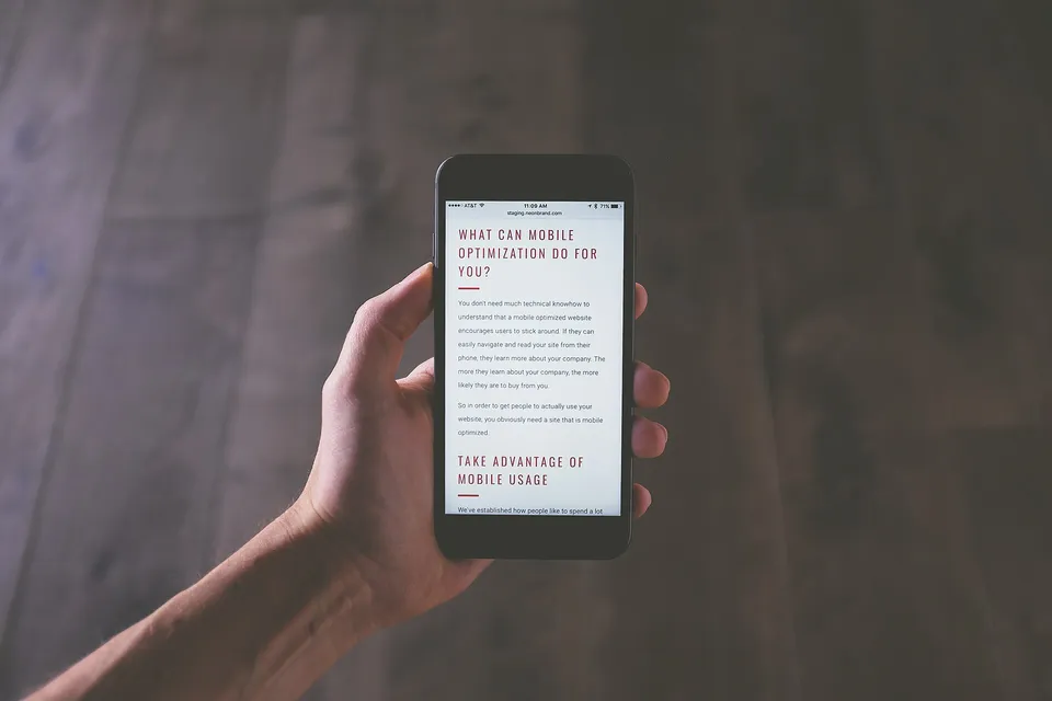
- Flow and text: NeONBRAND neonbrand, CC0
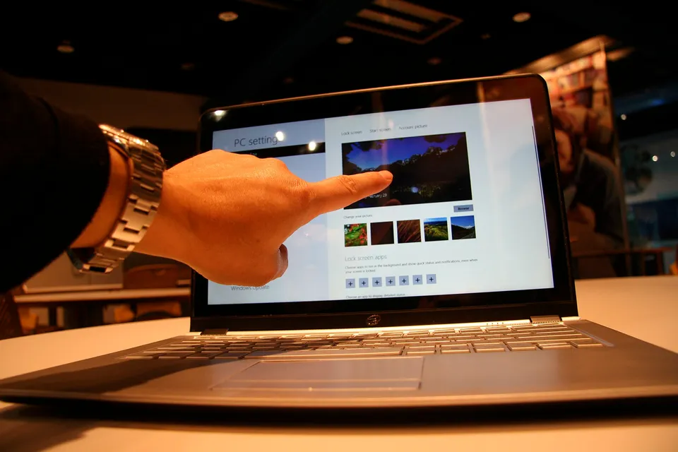
- Control panels and first screen: Intel Free Press, CC BY 2.0
- Measurement on equipment: Andyone andyoneru, CC0
What is measured
This audit area rates from findings and measured values, not from a countable set of rules. That is why this page lists which signals are collected.
Six device profiles
Smartphone (390 px and 320 px — the reference width of accessibility rule 1.4.10), landscape phone (844 px), tablet (768 px), desktop (1440 px) and wide (1920 px), rendered in the real browser — no mere window reduction.
Minimum font size
Whether flow text on the phone is at least 12 px large – smaller font is illegible without zoom. Measured at each visible text node of the mobile profiles.
No horizontal scrolling
Whether content exceeds the screen width (WCAG 1.4.10). The report names the supernatant pixel count and, where unique, the causing element.
Size of control areas
Whether buttons and links measure at least 24×24 px (WCAG 2.5.8) — with examples of too small areas.
No text overflow
Whether text runs out of its box or is cut off, instead of overturning. Measured per instrument profile.
Content in the first screen
How much readable text is visible without scrolling — a page that shows only one image above says nothing to visitors and search engines at first.
Call for action visible
Whether the central button in the first screen can be reached, instead of only after scrolling several times.
Elements fit in the display area
Whether individual building blocks — tables, embedded content, images — are wider than the device.
Two measurements per profile
Each finding is collected twice; It is only reported what both runs see. If a result fluctuates, it is expressly stated in the report instead of a random finding.
Good to know
- Three real device profiles in the browser — no window reduction.
- Operating surfaces are measured, not estimated.


.jpg)

.jpg)